
Badass (Presenting) Presentations — 24 ways to avoid messing up while presenting

I had my fair share of bad presentations. I gave terrible presentations. I watched slow-moving train wreck presentations. The vast majority of advice and tips you get about presentations are stylistic. There is nothing wrong with that. However, have you thought “the presentation’s content and storytelling were perfect, but it failed because it didn’t apply good typography”? I don’t want to disregard style and format, but excessive energy is spent on the wrong priority.
There are great books about how to create and deliver great presentations (list below). The purpose of this article is to cover a few fundamentals and draw from my experience on how to avoid presenting and presenting train wrecks. Don’t expect PowerPoint or Google Slide tips.
Here are my tips for creating and delivering badass presentations:
#1 Understand the medium (Show vs. Email vs. Print)
It’s the most basic question you have to answer before you even get started: How will people consume this content? Will people use this presentation with a print out in front of them? Is this presentation meant to be emailed for them to read by themselves? Is this presentation meant to be shown on the screen/projector? Everything, absolutely everything about the format, content, story flow, style, information density, and everything else depends on answering those questions. You might decide you want to do all three (show, email, print) in a single slide deck. I have news for you; you can’t. You’ll have to pick what you want to optimize. You might have to create two versions of the presentation to address all three mediums. You’d have to be a superstar presentation creator to be able to accommodate all of those mediums in a single set of slides. Guess what? You are not. Otherwise, you wouldn’t even be reading this post!
#2 Know your audience
A presentation to the sales team won’t be the same presentation to the executive team or the same presentation to the engineering team. You have to know who you’ll be presenting to, so you can tailor it for the audience. You can try building a more generic presentation, but then you’ll have to find the least common denominator. Depending on the goal you are aiming for, that might be fine. For example, a presentation for an All Hands should be superficial. In contrast, a potential partner presentation might focus on integrating the technology and going deep into one part only.
#3 Know the desired outcome
“At the end of this presentation, people will _____.” Be more knowledgeable about a topic? Find a solution to a problem? Be able to use a new service? Be more interested in buying my product? Agree to fund this initiative? That’s the main arc of the presentation. The biggest mistakes I see regarding desired outcomes are two: 1) The lack of one, or 2) Too many desired outcomes. Usually, the lack of the desired outcome happens because someone in the organization tells you, “hey, it would be great for you to present product Bluefin to the sales team,” and you just go ahead without pausing and understanding what’s the purpose. Then, there are the “too many desired outcomes.” Usually, it happens because people want to cram too much into a single meeting. We’ll introduce the company, show the product, give them pricing information, and sell them on the solution. That’s too much. Most BD and salespeople understand this well, but it’s surprising how many people in product, engineering, marketing, recruiting, finance, and other roles don’t.
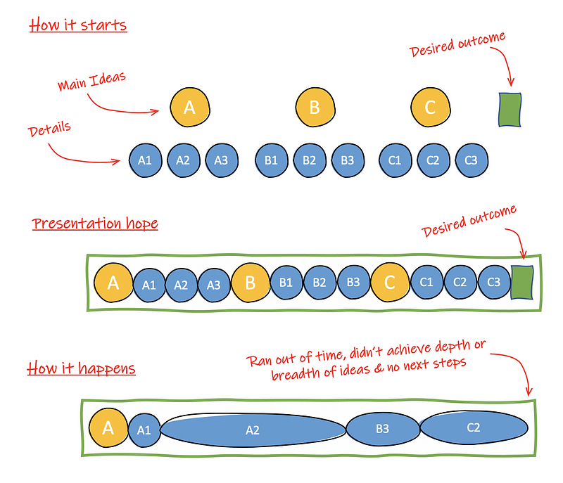
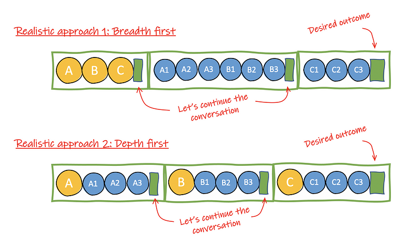
I think one of the most underused desired outcomes is “to level up the audience’s knowledge and continue the conversation.” Suppose you are a PM conveying a new product idea to the CEO, an engineering manager proposing a re-architecture to their team, a founder pitching a startup to a VC. In that case, it’s unlikely you’ll achieve your ultimate goal in a single meeting.
#4 Shared values
People will be a lot more attentive to what you are presenting if they believe you are coming from a place of shared values. These are not necessarily human values, although they could be. Here is a list of what these values could be: privacy, performance, cost reduction, long-term partnership, risk reduction, common competitor or competitive threat, innovation, etc. Ideally, you know or can identify those shared values before creating your storyline and your first slide. This way, you can sprinkle hints of those values throughout the presentation. One of my hacks is to create a slide early on in the presentation that states what I assume the participants believe in. I validate how on or off the mark I am before I go into a direction they might not care.
An excellent idea is to understand the shared anti-values. Shared anti-values can build a stronger connection between you and the audience. After all, it indicates you know them better than a simply shared value because it speaks directly to their pain and dislikes. Sometimes you just need to reframe the value. Instead of saying, “We care a lot about a responsive UI,” you can say, “we hate slow screens.”
#5 Shared ground
A presentation is like taking someone on a hiking journey. If you start from a different place from where the audience is, it’ll be a disaster. It usually unfolds on slide 4 or 5 when someone asks a question, and you realize they were in a completely different mindset when you got started. They either made some assumptions about what the presentation was about or because they lacked some knowledge to understand what you are saying. It’s also known as the Curse of Knowledge. Make sure that you know where your audience is and start from there. One thing to be careful of is to make sure you understand who are the critical participants. Don’t try to level down to all participants. If there is one decision-maker, two advisors, and five guests, you want to make sure the decision-maker and the advisor’s needs are met. Don’t try to appease all the participants.
#6 Strategy first
A presentation strategy determines the journey that you want to take people. It’s too easy to jump in and start combining a bunch of slides. It’s the equivalent of a product with many features, but it doesn’t address any particular use case well. A presentation strategy defines what should or shouldn’t be included, in what order, in what level of depth, and, most importantly of it all, for what purpose! It helps to think of a presentation as a product. The use case of this product is to achieve the desired outcome. The participants are the users. As if you were building a product, you need to define the product strategy before making it. When you create a presentation, you need to have a strategy first.
#7 The 1–2–3 Story
I’ll combine two ideas in a single tip. First, your presentation should have a beginning, a middle, and an end. Write a sentence describing what you want people to get in the beginning, what you want people to get in the middle, and what you want people to get at the end. 1–2–3 also represents 3-ideas. That’s the maximum number of new ideas or concepts you should be aiming for. For example, if you pitch your startup to an investor, you might want to focus on how painful the problem is for the customer, how massive the opportunity is, and why you are the right person to solve that problem. Everything that you put on slides ties to those three ideas. Honestly, this is one of the hardest things for me. I’m known to cram too many new ideas into a single presentation. Sometimes, I deliberately make a point (the point being, you won’t get everything I’m talking about but trust me, I’ve got this). Sometimes, I do that to optimize people’s calendar, and that’s usually a bad idea.
Tips #1–7 above are about information gathering and “pre-pre-production.” You shouldn’t start creating your slides until you have the above figured out.
#8 Keep the design simple!
Should I? No! What about ____? No! This cool new…? No! I’m talking about slide styles. Unless you are a designer, you should stick to the essential elements possible. Don’t try to be clever with fonts, colors, diagrams, animations, cat pictures, whatever. If you are not 100% sure that your styling will add value to the story and it’ll be perceived the right way, don’t do it. Don’t include obscure symbology like “arrows” to indicate objectives or squares to indicate tasks. If you use symbology, call it out explicitly in the slide. Most of the time, you think you are creative, but your presentation will look like a drunk PowerPoint more likely than not. Keep. It. Simple. Remember the wise words from Steve Krugman, Don’t Make Me Think.
#9 Careful with numbers
I’ve seen it all. My obsession with number formatting goes back to my high school, and my rigorous math and science teachers. If I didn’t use two decimal places for percentages, I lost a point in the test. If I didn’t use the thousand-separator, I lost a point. If the unit was one letter uppercase and one lowercase, and I didn’t write it correctly, I lost a point. Some care about number formatting and those who don’t mind it. If you don’t mind it, be aware that some of the participants do. However, that might not be as bad as writing confusing numbers.
For example, a table with the number $748 to mean $748,000 but nowhere it says the numbers on the table are in 1,000s (also notice that $ not always means US$). Missing units is another problem. It kind of matters if you are talking about 200 GB or 200 MB of data transfer per hour. But the worst of them all is the invented (or not well-known) metrics. Rates, ratios, scores, indices, and scales are often meant to abbreviate complex measurements into simple ones. It works well when everyone reading it has a shared understanding. It works poorly when people don’t. I’ve seen rates mean one thing and a key decision-maker thought it meant the exact opposite! If you will use a custom metric and are unsure if people will understand, add an explanation at the footnote, or include the full formula and values used to arrive at that rate/score/whatever. Even be explicit to indicate “big” is better/worse.
#10 Simplify diagrams
It’s common for an engineer or a PM to grab an extremely accurate and comprehensive diagram of a component, system, or architecture and use it in a presentation to another team or even to a customer. It feels that you might be doing the right thing because you don’t want to misrepresent how something works, but you are more likely creating confusion and taking the focus away from where it should be. Simplify the diagrams to the elements that are relevant to the points of that slide. It doesn’t matter if it’s not an accurate representation of the architecture or the system. These are called “marketecture diagrams.” Unless the point is an internal discussion about the architecture or system, you should remove every box, every arrow, and every label that’s not necessary to move the conversation forward.
Now, there is one exception! It’s a cool one and a power move, so use it wisely if you want to scare someone about the complexities of what you solve for them! Make the scariest diagram you can ever imagine, with all the arrows, boxes, and details. Show it to them, and deliver the money line: “See this? You don’t have to worry about any of it. We’ll take care of it for you.” If you want an example of this technique in real-life, search “SAFe for Lean Enterprises” on image search and click one of those images. The point is not to educate or lead anyone. It’s to scare the crap out of you, so you buy their consulting services. I’ve seen this being used very effectively in complex industries like healthcare, telecommunications, and financial services.
#11 Charts… oh boy!
There are so many ways to mislead people with charts. Logarithmic vs. linear scale. Monthly vs. accumulated metrics. Non-zero Y-axis. Manipulated scales. Truncated bars. Pie charts. Stacked bars and their order. I hope you don’t do any of those things. I despise them, and for the person that knows, you’ll lose their trust if you try one of these. Let’s assume ignorance, not malice from your part. Make sure you have proper X/Y labels and scales, use distinctive colors and symbols (light blue vs. medium blue vs. dark blue is not good!) for each series. Disclose if it’s logarithmic vs. linear. When appropriate, use trendlines. Don’t use bar charts as a replacement for line charts and vice-versa (learn about them). Also, avoid pie charts. You are likely going to use them wrong. Search Google for the problems with pie charts to understand the issues better if you don’t trust me.
#12 Accessibility
When people talk about accessibility, most people think about disability, which is fair. Make sure that your text and background have enough contrast. Make sure the fonts are readable — not too small, not too decorated. Ensure that you are using color sparingly to avoid confusing color-blind folks (4–5% of the population have some type of color blindness). Prefer videos with closed captions. Avoid using text rendered as images. However, accessibility is more than that. Using unnecessarily advanced vocabulary or terminology is a way to hamper accessibility. Using analogies or metaphors specific to your culture or ethnicity but not to others is another way to affect accessibility. Accessibility is about making the content accessible to the audience. If it’s not, you failed.
#13 Prime the key participants, particularly detractors
A lot of presenters love to be hailed as a hero. Instead of getting folks to contribute, collaborate, or provide feedback on their presentation ahead of time, they want a “ta-da” moment — the big reveal. Most of the time, it doesn’t work. Most of the time, it backfires on them. Depending on the situation, you might want to get someone else’s opinion about the entire presentation. Maybe you want to get a question answered by a critical decision-maker even before you define the storyline. Perhaps you know you’ll find opposition from a specific person or team, and you want to prime them to acknowledge a concern that won’t be covered in the presentation. All these pre-presentation work won’t guarantee things will go great but will significantly reduce the chances of going horribly wrong.
Tips #8 to #13 above are about preparing the presentation. The following tips are about the delivery.
#14 Don’t let tech issues ruin the moment
Make sure you test your video and audio if needed. Make sure your connectivity is working. Have offline copies of everything. If you are sharing your screen, turn off your computer notifications. Close as many windows and applications as possible. Have a laptop charger plugged in. Have whatever cables and adapters you might need. If you are streaming a video over a Zoom call, test with someone else first. The most likely person to blame if there is a technical issue is you.
#15 Assign roles
Unfortunately, the tools we have today are not very good for someone to lead a presentation, keep track of time, take notes, easily switch between a browser window and a presentation, read questions in the chat room, etc. More likely than not, you might need some assistance. Hopefully, you enrolled in that assistance ahead of time. You can also assign it on the spot: “Hey, Daniel. Would you mind keeping track of time and letting me know when we are 15-minutes from the end of the meeting so I can give a demo?”
#16 Don’t lose track of time
How many times have you been on a presentation where the person presenting couldn’t get past slide number five or six out of 15? First of all, it could be that you screwed up on your storyline and flow altogether. It could be that you try to cram too much. But assuming you took care of all those things, you didn’t do a proper job of moving the story along and let too many side conversations happen. It’s a delicate balance to know when to push back on questions and discussions and when to let them progress.
#17 Establish context
Don’t assume people know why they are there. Don’t think people know what’s being discussed. In this day and age, people might be going from meeting to meeting on auto-pilot without doing the proper context switching. You should consider starting your presentations as if you are officiating a wedding. “We are gathered here today to _____ (desired outcome). We’ll talk about _____ (topic)”. It’s also the perfect time for you to lay the ground rules and phone use rules, participation expectations, breaks, etc. Finally, if you feel things might go in a direction or open a door that you don’t want it to open, spell it out early: “X, Y, and Z are important, but we aren’t covering it in this presentation.” Call it the anti-agenda items.
#18 Tell them what you’re going to say, say it; then tell them what you’ve said
This is one of the oldest pieces of advice about presentations. The opening context should be enough to understand why this presentation matters and identify what they should be paying attention to. Once you deliver the presentation, they will be able to determine what is signal and what is noise. In the end, you can repeat the key takeaways, so they are more likely to recall them later.
#19 Create engagement spaces
What’s the purpose of the presentation? Is it a one-way delivery with a possible Q&A at the end, or is it more a choose your own adventure with the participants? A presentation to help two engineering teams, in the same company or not, define a proper interface is more collaborative. You want engagement throughout the presentation. A more informational presentation might still have opportunities for conversations, but it’s not about creating something new. For example, when your Human Resources department explains a new set of policies around vacation, the decisions have been made, and they are just educating the participants in the new policy. The point here is that you should create the right space for engagement, based on the presentation type.
#20 Don’t read the slide text, but if you do…
You’ll see a ton of advice about not reading the screen’s text and not reading bullet points. It’s much easier said than done. First of all, if you have a block of text that’s a passage of a book or article or a customer testimonial, you can tell people to read it by themselves, you count a few seconds, then you continue. But even for those and the bullet points on the slides, I believe that a well-spoken or expressive readout works really well. The key here is not to be monotone. Change pitch, speed, pause; use emphasis; even add some hmms and ahhs! Yes, hmms and ahhs should be avoided when giving a speech or presentation, but if you add them when you are reading something, it sounds more natural.
#21 Improve your speech style
Since we are talking about speech already, make sure you acquire this skill. Some people are too damn boring when presenting. They are dry, monotone, have no expression, and it feels like they are reading from a script they wrote for themselves. You have to remember that people can listen and understand content two to four times faster than you can talk. If the signal-to-noise ratio is not high enough and not fast enough, people will doze off. Worse, people will multi-task, and you lose them. People want to hear passion! They want to hear someone who cares about the topic and about being there. They want to be surprised but don’t use gimmicks because that might backfire. If you need help, there is an online training, there is Toastmaster, there are coaches you can hire. When I was in my early 20s, I spent the equivalent of a month’s salary to attend public speaking training, out of my pocket. I still have vivid memories of some of the lessons I learned two decades ago.
#22 Watch for detractors and the parking lot
You might get one or more people that are hard to manage while you are presenting. There are so many stereotypes that are hard to cover all here and what you can do about it. I could write a book about what not to do about it because I tried it all. You can eliminate most detractors ahead of time by ensuring people are consulted and involved in the presentation early on. You are not seeking consensus; you are getting them to accept a version of the story you’ll present. The two most common types of detractors I’ve seen are people who want to show 1) how smart they are or 2) how powerful they are.
Some people want to show how smart they want to impress someone else, like an executive. The “smart” kind of detractor is straightforward to deal with. You just need to stroke their ego — “What a great question?! Let me save that to the end to make sure we cover the rest of the content”. They just want acknowledgment they are smart.
The power-people want to show you “your place!” They want to dominate you. Sexism and racism play a role here. Whatever move you make, they will react in equal force. An effective way, which I don’t recommend, is for you to point out in front of everyone what they are doing and transfer all the power to them. That’s not the game they want to play. They want you to push back or defend yourself. When you don’t pushback, they get lost. It’s not about being submissive, though. It’s about bringing the power-play to the surface. “If I knew you knew so much about this, I’d have asked you to create the presentation.” Alternatively: “You are making it hard to give this presentation. Yes, there are problems that we can address later.” They will either calm down or become defensive. The problem with that tactic is that the rest of the presentation might feel awkward. Tread lightly.
A second tactic is to open a live document that everyone can see and type whatever the person is saying, intending to come back to it later or for them to feel like you aren’t dropping the ball. That’s probably best if this person is superior to you in the org chart.
#23 Always stop 5-minutes before the end
No matter how many slides you could cover or not cover if you have only 5-minutes left in the meeting and you can’t finish the remaining slides in under a minute, you should switch strategies immediately. You are switching to wrapping up mode. In wrapping up mode, you’ll repeat the key ideas and takeaways you presented, and you want people to remember. You’ll repeat anything important and decided. You’ll tell people what you’ll do next (“schedule another meeting,” “send a follow-up email,” “reach out to another person,” etc.). Let people decompress. Let people add another thing or two to your list. Ask the key decision-makers what else they would like you to do next or recommend the next steps. If you don’t do a wrap-up, the meeting will feel like a waste of time.
#24 Follow up
If you know anything about business development and sales, you know deals are won or lost because of follow-ups. Presentations are like that. Whatever desired outcome you wanted from your presentation, even if achieved, needs to be followed up to become concrete. If the presentation was informational, I recommend a follow up with a text version of the content or an easy to consume FAQ-style message. If the presentation was about facilitation, the follow up should include a summary of key decisions, action items, and open questions.
Recommended reading
- Slide:ology by Nancy Duarte
- Influence by Team Robert Cialdini
- Confessions of a Public Speaker by Scott Berkun
- Never Split the Difference by Chris Voss
- Don’t Make Me Think by Steve Krug
📬 If you have thoughts about this piece, shoot me an email even if you disagree with me.
BADASS SERIES
Badass Meetings
23 tips on how to tackle the “too many meetings” problem
Badass Email
How to conquer your Inbox forever
Badass (Presenting) Presentations
24 ways to avoid messing up while presenting